How would you describe your style?In our production, notions
of style are not really important; neither is that of an author
associated with it. Our name, “My name is”, means we can sign every
project as a collaboration with a third party (client, artist, etc.),
rather than a personal creation (“My name is John Doe”, “My name is
Artligue”, etc.). This is an aspect we’re very keen to put forward when
presenting our work (on our website for instance).
We also tend to
favour approach over style: we try to find the right answer for a
request, a need, a problem, based on the project’s context, its
characteristics and its target audience; we also try to strike the right
balance between form and substance. Style may therefore vary from one
project to the next.
Of course, there can always be certain elements
that regularly appear in our production, such as the economical use of
resources and a focus on efficiency. This is often reflected in our
overwhelming use of typographic fonts.
What are your main sources of inspiration (artists, graphic designers, etc.)?Everything… and it tends to vary from one day to the next.
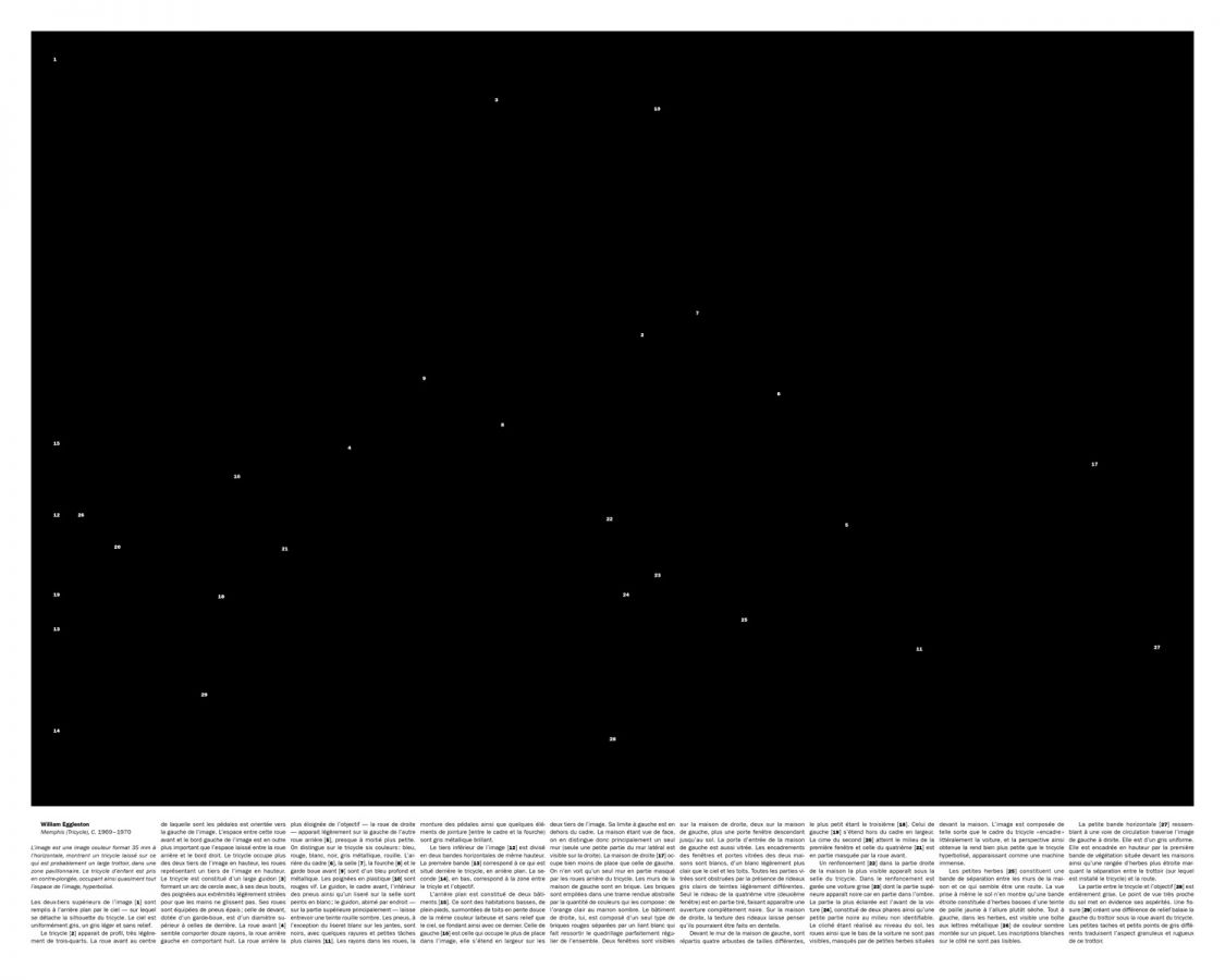
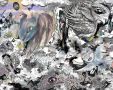
What can you tell us about the works on display at ArtLigue?The starting point of both works is a photograph.
It’s
not shown: it’s replaced by a rectangle signalling its presence, and a
description below. The description is objective (no interpretation) a
little frantic, and comprehensively describes every single detail of the
picture.
For this project, we started by selecting two things we
were interested in the theme Artligue suggested: the first was our
relationship – as My name is - with this medium, both as consumers of
images and as graphic designers and art directors. As art directors,
precisely, we work with photos every day: we use them, we make them, we
do DTP on them… we consume lots of them. For us, images always work with
another tool: text. Our work often consists in combining these two
elements: text and image.
The second thing we were interested in is
the idea that a photograph is not necessarily restricted to its subject
or the action it captures. It can “freeze” vast amounts of details that
you hadn’t noticed or understood. This idea fits quite well with the
work of William Eggleston (someone we particularly like); in his
pictures, behind seemingly banal and ordinary subjects, many things are
concealed. You can look at the two photos we chose as pictures of a
tricycle and a child with a red cardigan... but you can also see all the
rest.
What was the creative process for this work? Is it consistent with your usual approach?
Do you use different creative methods depending on the nature of the project (artistic, commission, experimental)?Usually,
the origin of a project is a commission: we are asked to provide
answers, and that involves needs, constraints and context. The
inspiration and visual desire we inject into a project are determined by
these pre-existing constraints. The message we give form to - through a
visual identity, a publishing project, a poster, an album cover – is
originally not our own. Whatever our level of involvement in a project,
there is always something that pre-exists and that comes from elsewhere.
So
the creative process for this work was inherently different from our
usual creative process. In a project such as this one for Artligue, the
fundamental difference for us is that we’re not expected to construct a
response to a need, but to create an image directly from our own desires
and projections.
That said, whatever the commission or medium, the
process is essentially the same: a lot of discussion, a lot of questions
and doubts...
The two of us work together precisely because of the
permanent exchange and our desire to challenge our work as much as
possible.
What is your view on graphic design today?We feel the situation of graphic design is somewhat paradoxical.
On
the one hand, the context is pretty exciting: lots of great studios,
excellent graphic designers, good training options, emerging scenes
around the world and extensive diffusion through blogs and magazines.
But on the other hand, the fact that graphic design, although pervasive
in our society - packaging, posters, logos, signage, newspapers,
websites, etc. – generates very little interest beyond a small circle of
professionals and insiders (as evidenced by the fact that no venue in
France is dedicated to it). As a result, the output is largely poor and
uninteresting, standardized or even automated: creation is often
stifled, subjected to the laws of marketing and advertising. There is
also a critical lack of education of the eye, and therefore a limited
design culture.
This is one explanation for our sector’s lack of consideration.
Do you believe there is a boundary between visual arts and graphic design? If so, where would you place it?
Should graphic design be included in the arts, or does it already belong there?At
My name is, we pretty much accept the concept of commission that comes
with the job, and the idea that we serve a message that doesn’t belong
to us (this is even reflected in our choice of name).
That would tend
to exclude us from the artistic field. It’s true that we partly work
with the same tools and language, but the driver and purpose are
completely different. We are designers: we create things that meet
needs. And as we said earlier, we’re not after the “author” dimension in
our production, and prefer to present projects as collaborations.
Actually, the whole question of a boundary between art and design does
not really arise in the way we practice graphic design.
Limited edition, numbered and signed.
 Alexandre Bouichou + Thomas Ibars
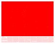


 Collection
 About
About  Contact
 wishlist
 Newsletter


